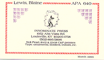
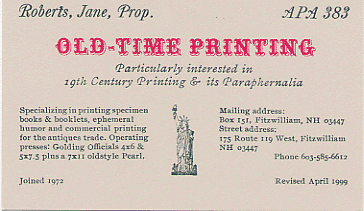
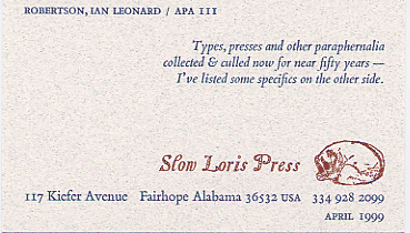
Prop. Card Contest
Within three months of joining the Amalgamated Printers' Association a new member must submit his or her Prop. Card to the membership. It introduces the "Proprietor" to the membership and tells a little about his/her press and its purpose. There are few constraints on a member as to design. As time goes on, a member may do a arevised Prop. Card if any information on his or her card changes.
In April 1999 the APA held a contest encouraging members to do a new card. About two sozen members participated. Below are some examples with judge's comments.
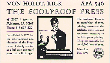
Overall, I was favorably impressed with the entries. None of the entries tempted me to recommend that the perpetrator's press be confiscated. There seemed to be good design, some ingenuity, and an almost universal acceptable level of presswork.
Rick von Holdt's (1st place) card caught my eye on the first pass through the group, although for some time I resisted the idea of giving a prize to a black-only entry. But the fact of the matter is that it doesn't need color, and everything is simnply done right. The type faces blend very well, and provide an excellent complement to the weight of the cut. THe type is very well-spaced in the narrow measure, and all of the specified elements are in the proper place. The available space is filled neatly and precisely, without any crowding.
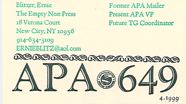
Ernie Blitzer's (2nd place) entry, on the other hand, uses off-beat color to good effect, and the oversize APA number provides visual impact. I'm not sure of the logic of placing the primary emphasis on the member number, but it works well visually and the other elements are in their designated locations. Again, the type face and ornament choices blend very well.
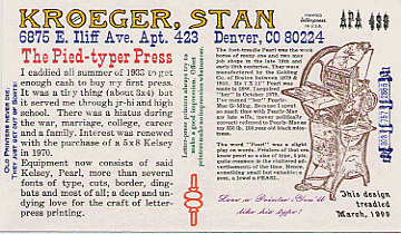
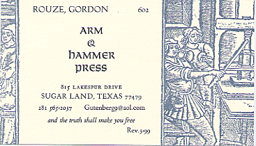
I took the liberty of specifying two Honorable Mention entries. Stan Kroeger's card is a tour de force of a period piece, very well executed. The minuscule (pearl?) type set into a perfect run-around is a marvel. Gordon Rouze has used the illustration in an original and imaginative way to produce a very tasteful and attractive card.
—Dwight Agner, #2